
The Best Backsplash For A Busy Countertop
Posted by Kirsten Sharp on Jul 18th 2025
Last week, I worked with a client who had concerns about her "busy" countertop.
(By "busy" she just meant that it had a lot of pattern, different colors, etc.)
Her question was: If her countertop already had a lot of pattern going on, could she still pick a patterned backsplash?
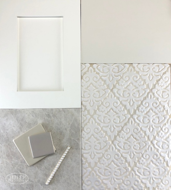
Shown Above: Damask Handmade Tile in Glossy White (retired color) | Closest current color: Glossy True White
The short answer (in my opinion) is yes!
But there's a little more to the story so stay with me here. There's a key concept to keep in mind:
"Busy" has a lot more to do with the amount of contrast between the tile & grout colors, and less to do with how "busy" the tile pattern actually is.
In other words, even if you went with a simple subway tile you may end up with a backsplash that looks "busy". If you chose, say, a black subway tile and white grout - that would still look busy.
What I would suggest in this situation is to keep a minimal amount of contrast between the grout and tile color.
Low Contrast Backsplash = Ideal for "Busy" Counters
The combination below, for example, shows very low contrast between the tile color and the grout color - they're pretty much the same color, right?
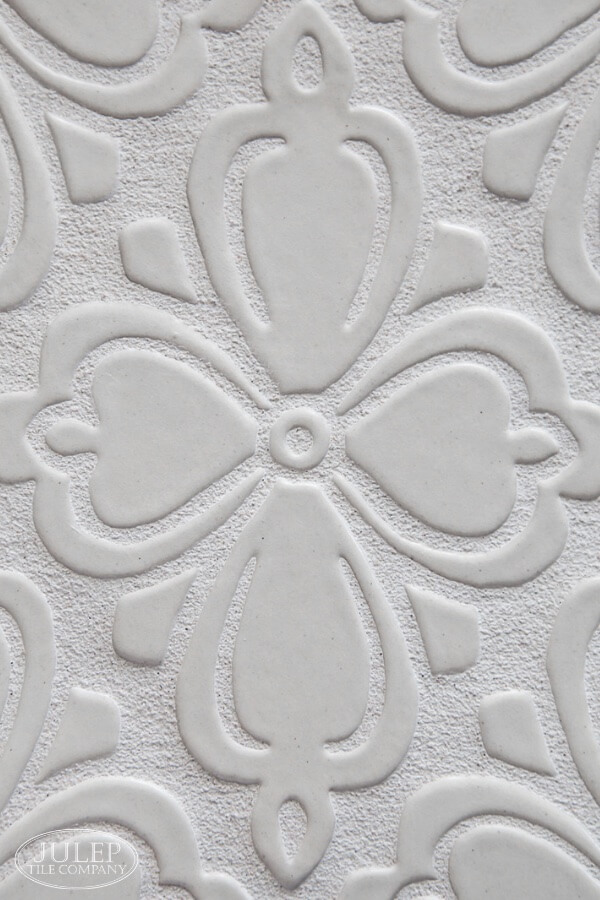
Shown Above: Brocade Handmade Tile in Glossy Soft White (retired color) | Closest current color: Satin True White
When installed, the example above will read more like a solid, single color with a cool texture to it. With a backsplash like this, you could absolutely get away with a countertop that had a busier pattern.
In fact, here's an example of a kitchen below that shows this concept exactly - The backsplash tile color and grout are both cream, which doesn't look overly busy next to the admittedly "busy" countertops.
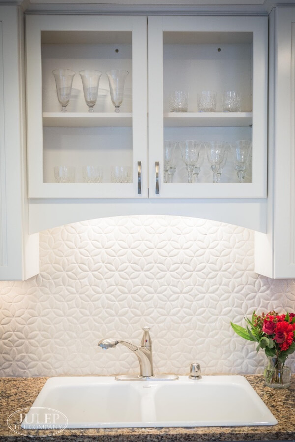
Shown Above: Bloom Handmade Tile in FC Cream Crackle
High Contrast Backsplash = Ideal for Solid Counters
And here's an example of the opposite - a high contrast tile & grout combination. The photo below shows a dark glaze with a light grout.
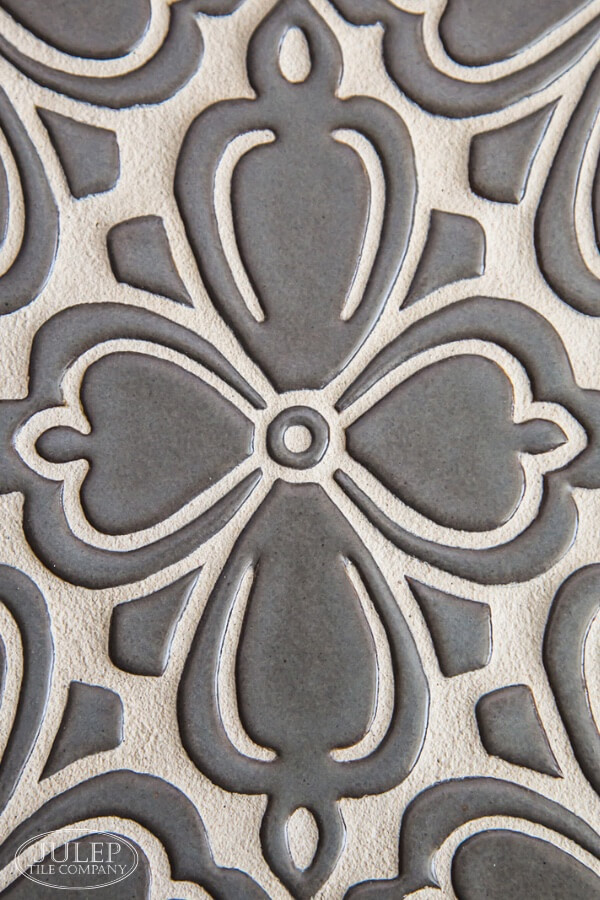
Shown Above: Brocade Handmade Tile in Steel Gray (retired color) | Closest current color: Satin Black
The combination above will make a really beautiful backsplash, but I would advise choosing a solid colored countertop if possible.
Make sense?
As with any interior decorating "rule", I'm not saying it can never be broken - I have no doubt that there are plenty of gorgeous kitchens with busy countertops and busy backsplashes.
My point is that these are good guidelines to keep in mind as you're making decisions regarding your hard finishes - especially if you want a kitchen that doesn't look... busy!
Need tile samples?

RELATED POSTS:
5 Tips For Timeless Kitchen Design