
What Color Should I Pick for my Backsplash?
Posted by Kirsten Sharp on Apr 18th 2025
Today we’re answering a reader’s question. Sharon writes:
“I am in the process of getting a new kitchen. I chose Kraftmaid kitchen cabinets in the color Canvas. My countertops will be quartz by Silestone in Lusso. My floor will be luxury vinyl tile in (travertine). I think I want subway tile but not sure what color?? Any suggestions? Need help.
I am even having trouble picking out a wall paint color. I am thinking of just matching the wall color up with my cabinets. My kitchen faces North so it is not easy to do. One color that matches close to me is Creamy from Sherwin Williams. Can you give me any suggestions with this too?”
First, let’s have a look at the finishes Sharon has already chosen.
The Kraftmaid cabinets in the Canvas color are a pretty soft white with yellow, perhaps slightly pink undertones.
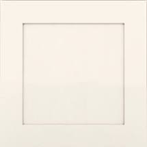
Shown Above: Kraftmaid Cabinet in Canvas
Her Silestone Quartz countertops in Lusso are great because they give us some options for introducing other colors in the room, while simultaneously pulling them all together in one surface. As you can see there are some nice greiges, whites and gold tones. (Nice countertop choice, Sharon!)
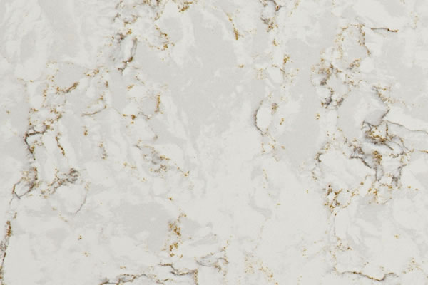
Shown Above: Silestone Quartz in Lusso
While I couldn’t find an exact photo for the flooring, it appears that it will also feature warm white/gold tones. As long as the undertone doesn’t majorly clash with the other finishes in the room, I’d say flooring choices overall are less important in the grand scheme of kitchen design. Most wood floors can generally be treated like your favorite pair of blue jeans that go with everything.
Now Let's Pick Some Colors!
Now that we’ve reviewed the finishes that Sharon’s already chosen, let’s find some coordinating wall and backsplash colors. My favorite way to do this is to pull colors from existing finishes - like the cabinets and countertops. Below are three options for Sharon's wall and backsplash colors:
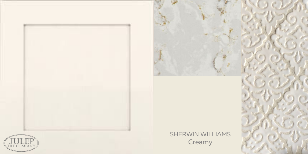
OPTION #1 - Match the Backsplash to the Cabinets
Sharon mentioned Sherwin Williams Creamy is a good match for the cabinets and I’d say she's pretty close - The cabinets appear a just a tad pinker than Creamy.
Since the walls would match the cabinets, she could carry on the monochromatic look by using the same Creamy paint on the trim as well - just in a glossier finish than the walls. (This is a super hipster paint technique I keep seeing pop up!) I would suggest adding a little bit of contrast on the backsplash by using our Glossy White glaze, as shown here on our Damask Handmade Tile.
OPTION #2: Pull Greige From the Countertops
The greige in the countertop is pretty, and it might be worth considering for the walls. For folks like my husband who roll their eyes when I say "greige" and think it applies to all neutrals known to man, it's actually just a very light version of gray + beige. Plus it's kind of fun to mix two words together.
Like Brangelina.
But I guess we all know how that turned out. I digress!
While it's always best to color match in person, for a "greige" I would suggest trying Benjamin Moore's Classic Gray. I paired it below with their Simply White which could be used for the trim. Simply White is a dead ringer for our New Satin White glaze so I would use that on the backsplash.
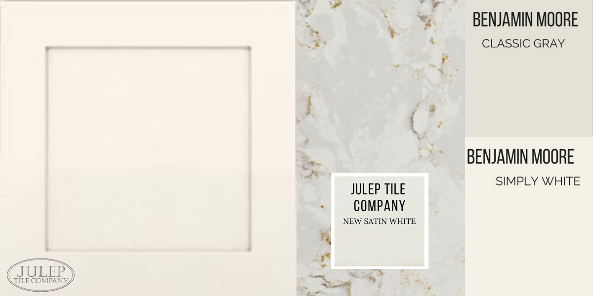
Tile Shown Above: 3x3" Color Swatch in New Satin White. Shop all our white tile colors here.
OPTION #3: Pull Gold from the Countertops
For something a little bolder, you could pull the gold from the countertop for the wall color. I'd suggest Benjamin Moore's Muslin as it has a faint pink undertone, similar to what appears to be the undertone of the cabinets. If the cabinets aren't as pink as they appear in the photo, try Benjamin Moore's Manchester Tan. For a coordinating backsplash that would highlight some of the gold tones, try our Cream Crackle glaze. It has some subtle sparkle to it and you can never have too much sparkle, in my opinion!
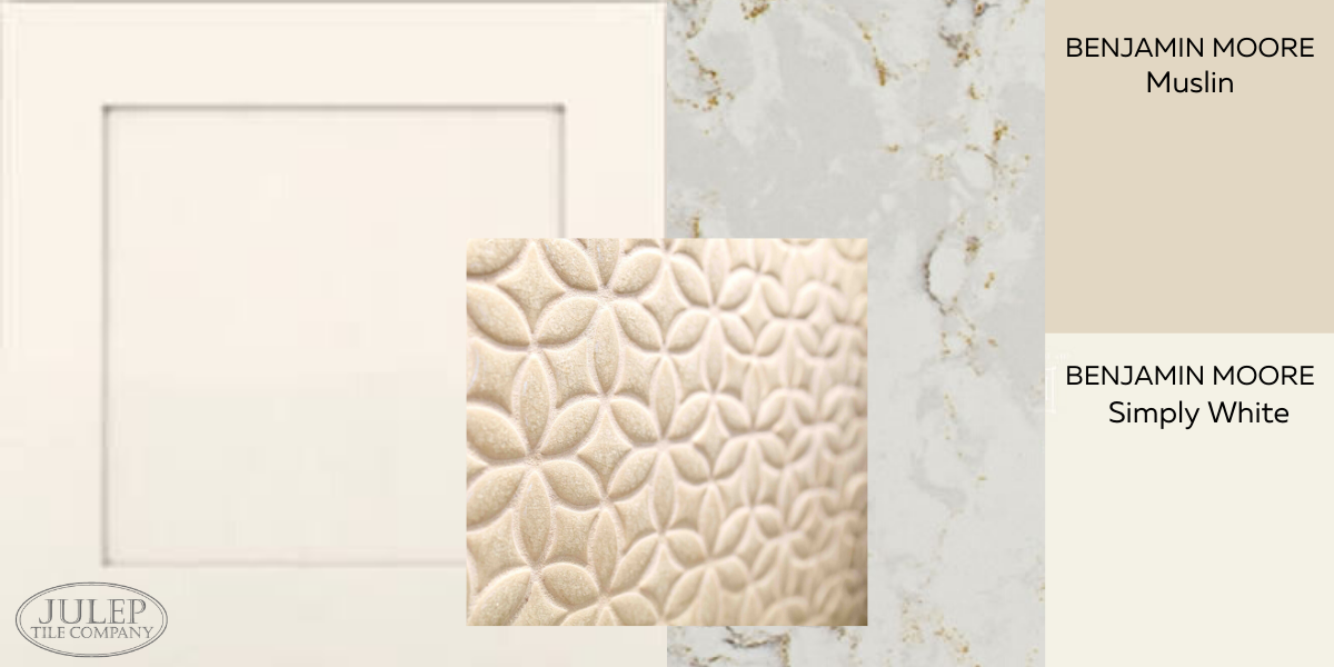
Tile Shown Above: Bloom Handmade Tile in Cream Crackle
KEEP IN MIND: Comparing photos online is a good way to get started with designing your kitchen, but whenever possible make sure you order samples so you can see the colors/finishes in person. Here's a list of the ones we talked about today.
Colors & Finishes Mentioned:
Need tile samples?

RELATED POSTS:
5 Tips For Timeless Kitchen Design
3 Backsplash Tile Ideas For White Kitchen Cabinets
How To Create A Whole House Color Scheme