
How To Choose The Right White Tile
Posted by Kirsten Sharp on May 2nd 2025
White has been one of our best-selling tile colors this year, and I can't say I'm surprised. Decorating with white has been gaining in popularity over the past few years - whether it be for your backsplash, wall color, or even your exterior house color.
Although it may sound like a trendy choice, I'd argue that white is actually one of the most timeless colors you could choose - which is especially important on a more permanent finish like tile.
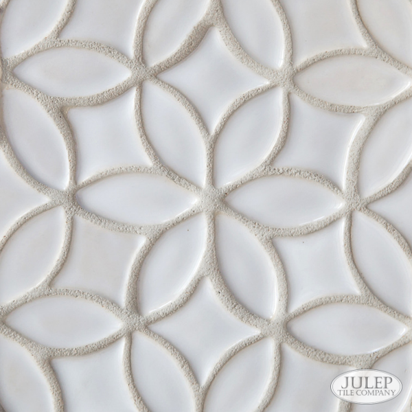
Shown Above: Bloom Handmade Tile in Glossy White (retired color) | Closest current color: Glossy True White
The beauty of using white on something like tile is that it allows you to swap out the color of less permanent choices (like curtains, rugs, accessories) should you want to change things up over time. Pretty much everything goes with white, so you've got a lot of options in how you decorate around it.
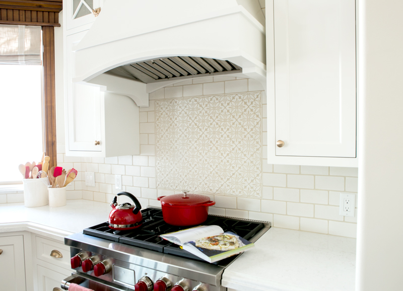
Shown Above: Cobham Handmade Tile and 3x6" Subway, both in New Satin White (retired color) | Closest current color: Satin True White | Thanks to Black Goose Design for the photos.
The tricky thing about white (as with many pale colors) is that it's hard to see what the actual undertone is. And as many of you may be finding as you work through your own renovations, there are hundreds of shades of "white"!
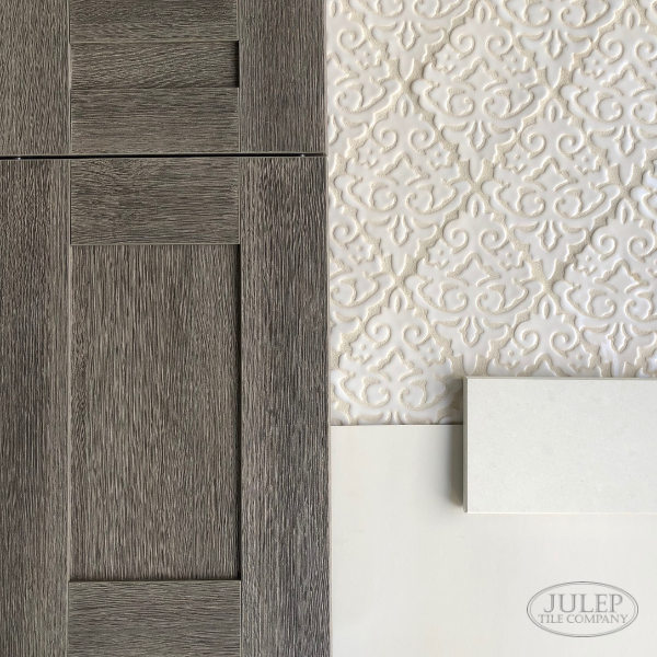
Shown Above: Damask Handmade Tile in Glossy White (retired color) | Closest current color: Glossy True White
The best way I've found to see the actual color is to compare it to a true white. If you're familiar with Benjamin Moore paint colors, Chantilly Lace is their whitest white and would be a good benchmark to use as a true white. Otherwise, just a sheet of printer paper will get you pretty close. Once you start comparing your white options to a true white, it will become much clearer what the actual undertone is (gray, yellow, etc.)
To illustrate this technique, here are 6 different white tiles shown on a wood background:
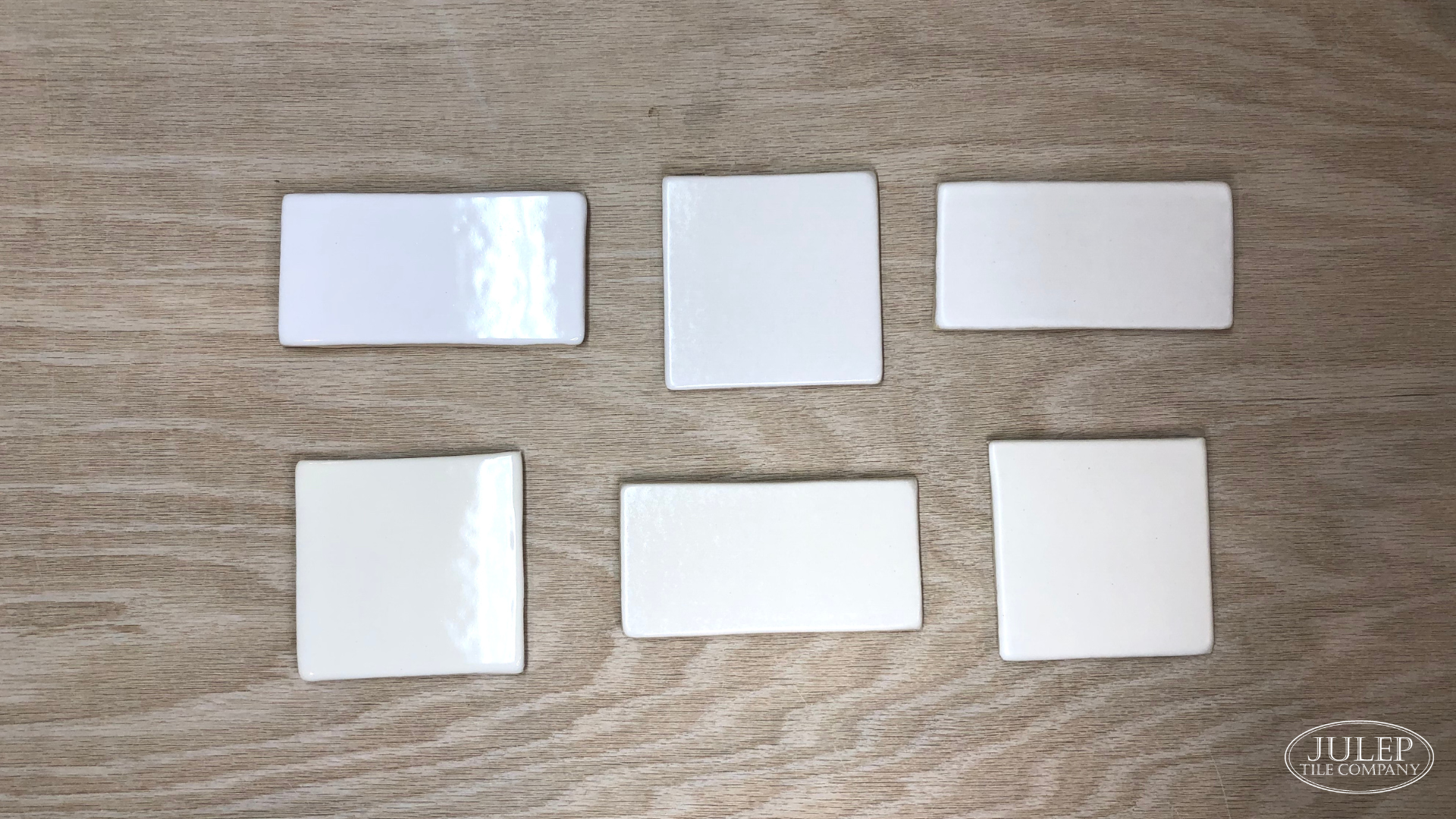
And here are the same tiles shown on a true white background:
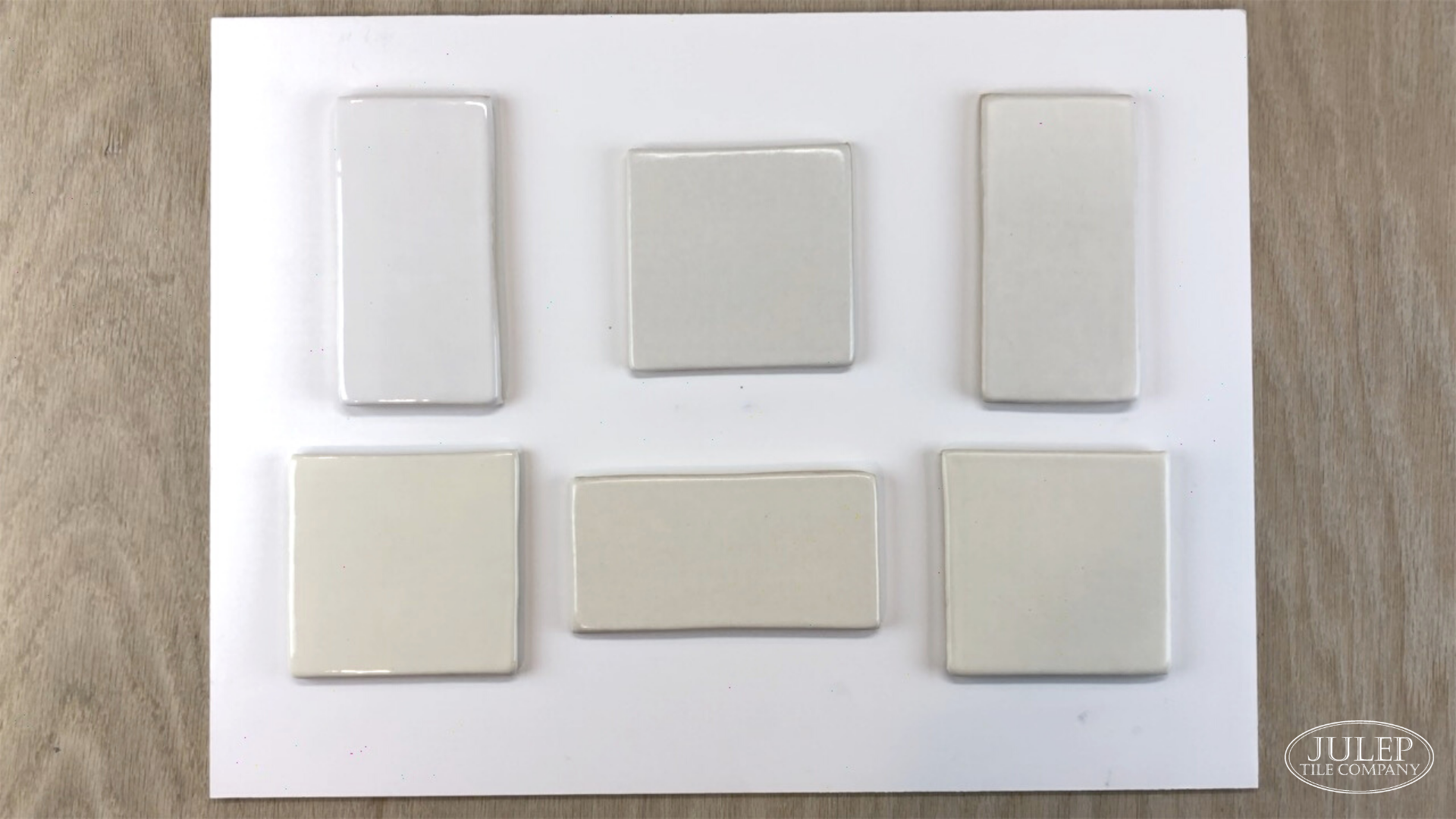
In the first photo, all the tiles look fairly similar. But in the second photo, you can see how the bottom row is much warmer than the top row. Pretty cool, right?
PRO TIP: Remember though, once you start picking colors to match your cabinets and countertops be sure to view each sample as it would be installed. For example, put your countertop samples on a horizontal surface and your cabinet & backsplash samples propped up on a vertical surface.
And be sure to keep a sheet of "true white" paper behind the samples like we learned earlier so your eye is not influenced by the colors in the background.
Need tile samples?

RELATED POSTS:
Will A White Kitchen Feel TOO White?
3 Backsplash Tile Ideas For White Kitchen Cabinets
How To Create A Whole House Color Scheme