How To Create A Whole House Color Scheme
Posted by Kirsten Sharp on Sep 5th 2025
If you've ever struggled to coordinate the colors in your kitchen, not to mention creating a whole house color scheme, I can relate!
A few years ago, I was having a particularly hard time decorating my living room. In case you're curious, here's the "before":
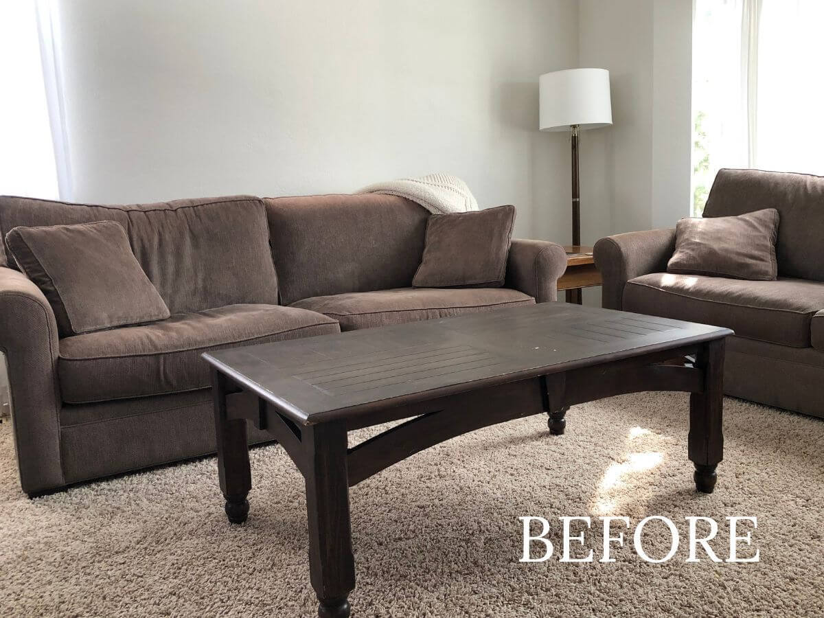
At this point in time, I was convinced that if I could just find the right paint color, my living room would somehow magically look like the ones I saw on Pinterest. Sadly, that was not the case. Not after Edgecomb Gray, not even after Revere Pewter!
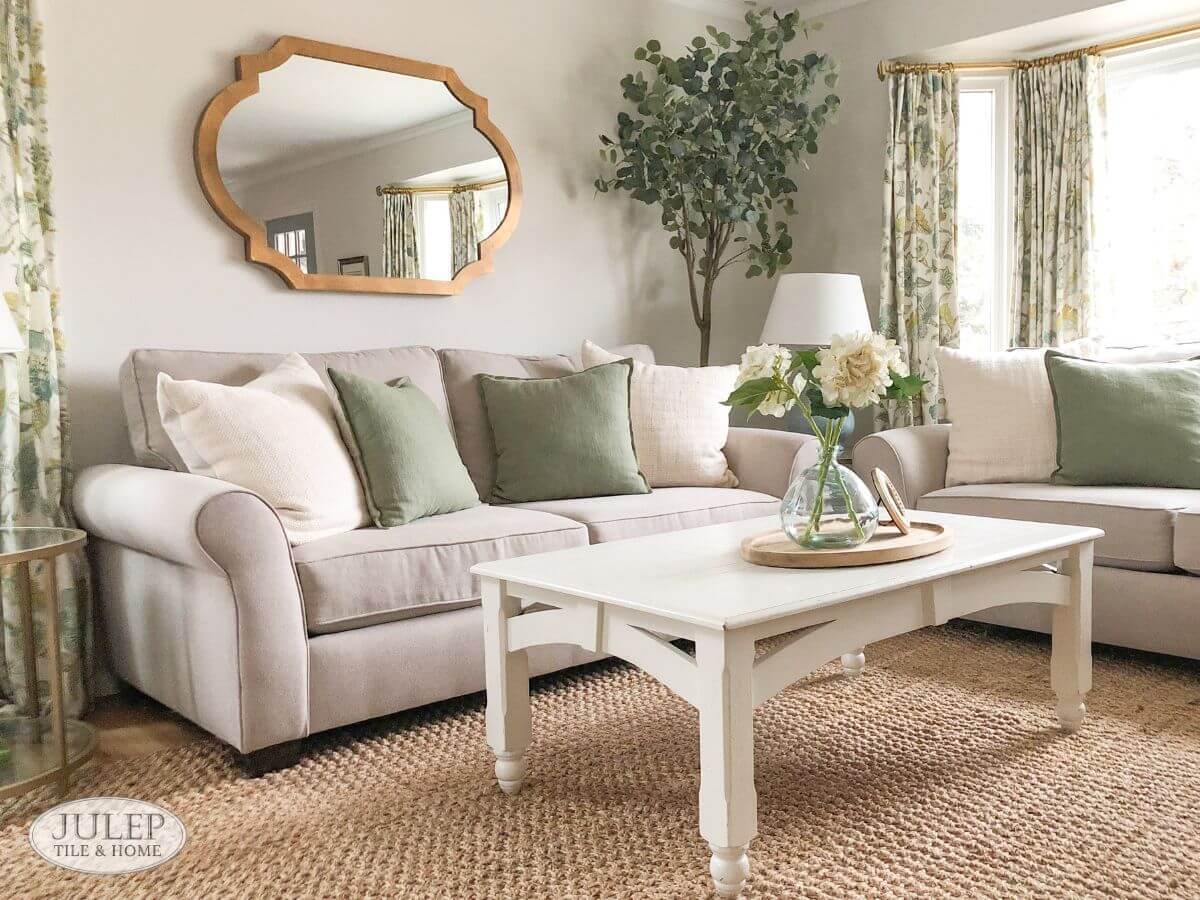
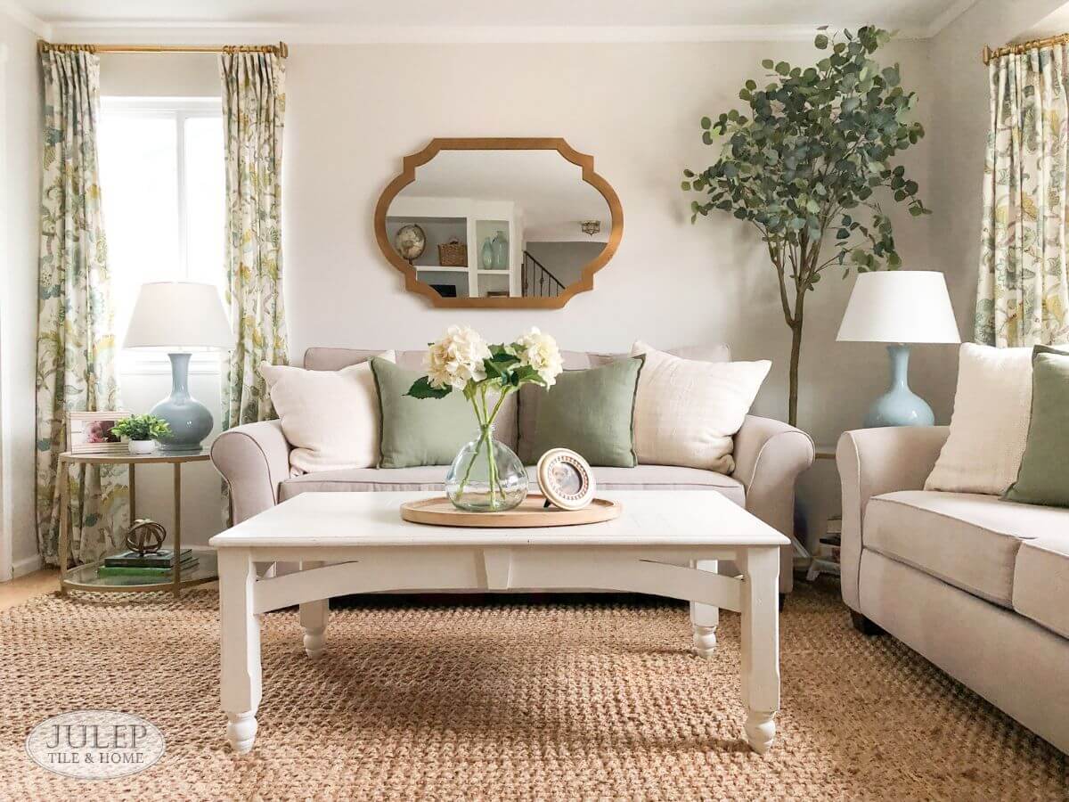
It wasn't until I learned one really pivotal design tip that things started to turn around. Here's my living room today:
So what was that design tip?
I was at a design course a few years back and the instructor said,
"When you're decorating a room, start with a patterned pillow or piece of artwork and pull your colors from there."
Now that may not sound earth-shattering to you but it was for me! I finally understood that no paint color alone would make my living room look the way I wanted it to.
I finally realized that what I needed was a color scheme to guide my decor choices, and that I didn't have to come up with those colors myself - I could look to an inspiration piece like a patterned pillow or piece of artwork to tell me what the colors are.
How To Create A Whole House Color Scheme
What I learned in the process of decorating my living room using an inspiration piece (in my case, it was patterned curtains), was that these colors easily extended into my other main living areas.
In other words, the inspiration piece WAS the whole house color scheme!
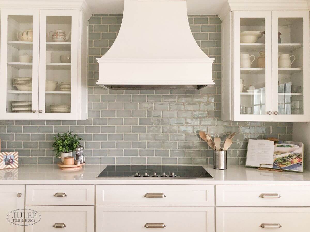
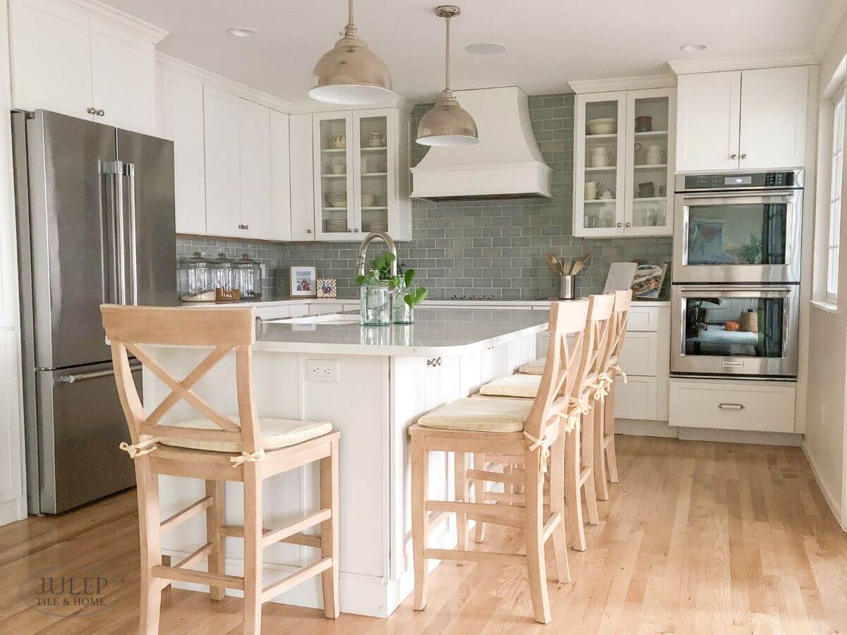
For example, here is my kitchen where you can see I pulled the blue tones from the curtains for my backsplash, and matched the green and light brown in the accessories:
Our glaze palette has changed recently but if you like the blue subway tile shown here, check out either our Turquoise Crackle or Light Blue Crackle.
And here's my dining room where you see a lot of similar colors.
So how can you replicate this in your own home?
STEP 1: Find An Inspiration Piece
Your inspiration piece could be something like:
- Patterned pillow
- Patterned curtains
- Multicolor area rug
- Artwork
Just make sure it's got several different colors (more colors is often better), and that they're colors you love!
STEP 2: Shop For Decor in Coordinating Colors
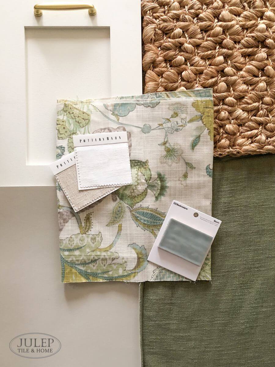
Now that you've got your color palette from your inspiration piece, all you need to do is find the remaining decor in colors that coordinate! So let's say your inspiration piece is a patterned pillow that has some beige, off-white, navy blue and green - start thinking about what colors you'd like to see where. Perhaps a beige couch, off-white curtains, and some green lamps to go with your patterned pillow?
I would focus also on any hard finishes like your cabinets, countertops, etc, as these are harder to replace. Have existing colors in your hard finishes that you need to work around? Find an inspiration piece that incorporates those colors and you're good to go!
STEP 3: Try Before You Buy
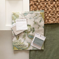
If possible, get samples of the home decor items you're considering so you can make sure they all coordinate.
I know this isn't always possible so another option is to pull together images of the home decor items - Simply take a screenshot of the product page and view all the images next to each other.
Do you still think everything matches and works well together? Or maybe one of the items isn't quite the right color? Remove that item and go looking online for one in a better color. I can't tell you how many times this process has saved me from big design mistakes!
Looking for tile samples? You can find all of ours here:
STEP 4: Repeat This Process In Adjoining Rooms
The idea of the "whole house color scheme", in my opinion, mostly relates to your main living areas - i.e. your living room, dining room and kitchen. Why? Unlike bedrooms and bathrooms that have a door you can close, most main living areas are open to each other. So it makes sense that you'd want to carry similar colors from one room to another.
Need tile samples for your own whole house project?
RELATED ARTICLES:
5 Tips For Timeless Kitchen Design
Will A White Kitchen Feel TOO White?
Perfect Countertops & Backsplash Benjamin Moore Pale Oak Cabinets

